Time Maps: Visualizing Discrete Events Across Many Timescales
Discrete events pervade our daily lives. These include phone calls, online transactions, and heartbeats. Despite the simplicity of discrete event data, it’s hard to visualize many events over a long time period without hiding details about shorter timescales.
The plot below illustrates this problem. It shows the number of website visits made by a certain IP address over the course of 7 months. It was built from discrete event data. The height of each bar is the number of events that occurred in each time bin.

While the plot displays the overall behavior, details about the timing of events within each time bin are completely lost. One can always zoom into a certain portion of the histogram and re-bin the data, but what zoom level should we choose, and what timespan should we examine? For example, if we want to zoom into individual days, we would have roughly 210 days to look at. Searching for patterns and outliers at various zoom levels would be very time consuming.
In this blog post, I’ll describe a technique for visualizing many events across multiple timescales in a single image, where little or no zooming is required. It allows the viewer to quickly identify critical features, whether they occur on a timescale of milliseconds or months. It is adopted from the field of chaotic systems, and was originally conceived to study the timing of water drops from a dripping faucet. The visualization has gone by various names: return map, return-time map, and time vs. time plot. For conciseness, I will call them “time maps.” Though time maps have been used to visualize chaotic systems, they have not been applied to information technology. I will show how time maps can provide valuable insights into the behavior of Twitter accounts and the activity of a certain type of online entity, known as a bot.
This blog post is a shorter version of a paper I recently wrote, but with slightly different examples. The paper was accepted to the 2015 IEEE Big Data Conference. The end of the blog also contains sample Python code for creating time maps.
Building a time map is easy. First, imagine a series of events as dots along a time axis. The time intervals between each event are labeled as t1, t2, t3, t4, ...

A time map is simply a two-dimensional scatterplot, where the xy coordinates of the events are: (t1,t2), (t2, t3), (t3, t4), and so on. On a time map, the purple dot would be plotted like this:

In other words, each point in the scatterplot represents an event. The x-coordinate of an event is the time between the event itself and the preceding event. An event’s y-coordinate is the time between the event itself and the subsequent event. The only points that are not displayed in a time map are the first and last events of the dataset.
Below are two simple examples:

For the sequence of evenly spaced events (A), the time map is effectively a single point, since the xy coordinates of the events are all identical. Sequence B is the same as A, except the timing of one event is slightly shifted. The resulting time map consists of effectively 4 points, making the shift easy to notice. Unless a very small bin size is chosen, the histogram over time for the two sequences would be exactly the same, concealing the changes in timing.
To get a more intuitive feel for time maps, here’s a heuristic diagram, which is divided into quadrants:
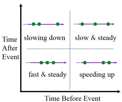
Within each quadrant is a picture of events along a time axis. The upper-right and lower-left quadrants contain events that are equally spaced between preceding and subsequent events. So both of these quadrants are “steady.” Since there is less time between events in the lower-left quadrant, it’s called “fast and steady.” The upper-right has more time between events, so it’s “slow and steady.” In the lower-right, an event occurs, there is a long waiting time, and then two events happen in rapid succession. So that process is “speeding up.” In the upper-left, two events quickly occur, followed by a long waiting time. In this case, the events are “slowing-down.” Viewing a time map is a bit like reading a map of a new city. While unfamiliar at first, it eventually becomes second nature.
The beauty of time maps is that long timelines are no longer an issue, since only the times between events are plotted. In cases where inter-event timing varies by orders of magnitude, we can scale the axes logarithmically. This allows the viewer to see time intervals that range from milliseconds to months in a single picture. Let's see some real-world examples!
@WhiteHouse Tweets
Twitter API allows you to gather the 3,200 most recent tweets written by a user. Using Twython, I downloaded tweets from the @WhiteHouse, which are mostly written by the president's staff. Here is the time map for tweets written between January and September 2015:
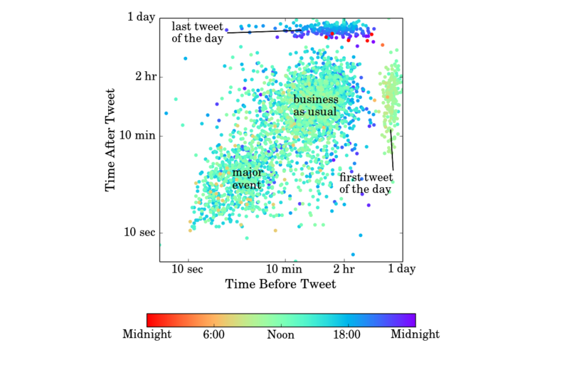
Each tweet is color-coded based on the time of day, and the time axes are scaled logarithmically. Two clusters correspond to the beginning and end of the workday, at least in terms of tweets. The first tweet of the day usually occurs between 9 AM and noon. The last tweet of the day can take place over a much wider time window.
Interestingly, there are two clusters that represent different modes of behavior. In the cluster I call “business as usual”, tweets are written roughly once per hour. The tweets in the lower left occur in rapid succession, and correspond to major events.
Since it’s hard to count the number of points in each cluster, a “heated time map” can be useful to show higher densities of points in red.
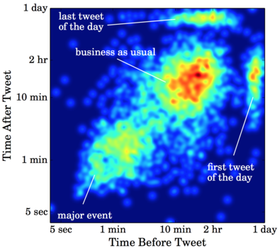
In a heated time map, we can still see isolated points. The added benefit is that we can also see densities when points are close together. It looks like the “business as usual” cluster has the most tweets, which justifies calling it “usual.”
Tweets from a personal account
A public relations staff manages the Twitter account of the @WhiteHouse. What do the tweets from a personal Twitter account look like? Nicholas Felton is a graphic designer who specializes in information visualization. His work includes annual reports that compile graphics based on data about his life. Below is a heated time map of his tweets:
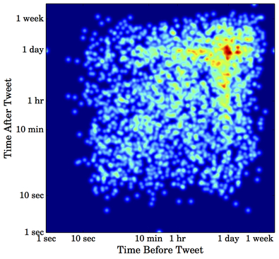
It does not contain the distinct clusters exhibited by the @WhiteHouse. Unlike a public relations account, tweets from personal accounts often do not adhere to a strict schedule. However, the time map still captures overall trends. Many tweets are written before and following 24-hour lulls. Also, a large number of points follow a “slow and steady” pattern, in which tweets are written roughly once per day.
Internet bot
Internet bots are computer programs that execute automated tasks on the web. Bots are
unwittingly installed on millions of personal computers when users click on certain links. A bot could even be operating from your computer as you read this sentence! I analyzed data from a company that provides monitoring services for various websites. This brings us back to the plot shown at the beginning of this blog:

It shows the number of website visits originating from a specific IP address (this IP address is different from the IP examined in my paper). While the histogram does contain important information about overall behavior, here is what the time map reveals:
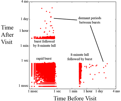
These patterns of activity cannot be achieved by a mere mortal. A few prominent features immediately jump out: a block of “fast and steady” points, bars of points that correspond to “speeding up” and “slowing down,” and finally, some sparse points beyond them.
The sparse points in the lower-right and upper-left represent long dormant periods between high levels of activity. This is consistent with the long gaps seen in the histogram. The bars of points correspond to 8-minute lulls between bursts of rapid activity. The bursts themselves are represented by the large block in the lower left, in which websites are visited in quick succession. The presence of bursts can be confirmed by examining an extremely zoomed-in histogram of the data:
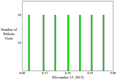
Just as expected, there are bursts of activity separated by roughly 8-minute lulls. Though the information contained in the zoomed in histogram is consistent with the time map, who would have thought to zoom in at this level?! The time map immediately revealed the bot’s regular bursting behavior, and unlike the histogram, no zooming was needed.
Creating Time Maps with Python
Below is a simple Python program for creating a time map. It's based on randomly generated data.
import numpy as np
import matplotlib.pylab as plt

# a sample array containing the timings of events in order: [1, 2.1, 2.9, 3.1...]
times = np.cumsum(np.abs(np.random.normal(size=100)))

# calculate time differences:
diffs = np.array([times[i]-times[i-1] for i in range(1,len(times))])

xcoords = diffs[:-1] # all differences except the last
ycoords = diffs[1:] # all differences except the first

plt.plot(xcoords, ycoords, 'b.') # make scatter plot with blue dots
plt.show()
Now let's create a heated time map. It builds off the program from above. Basically, a two-dimensional histogram is made, which counts the number of events within each grid-square of the time map. The histogram is treated like an image. Gaussian blur is then applied to the image, which smoothens out abrupt changes.
import scipy.ndimage as ndi

Nside=256 # this is the number of bins along x and y for the histogram
width=8 # the width of the Gaussian function along x and y when applying the blur operation

H = np.zeros((Nside,Nside)) # a 'histogram' matrix that counts the number of points in each grid-square

max_diff = np.max(diffs) # maximum time difference

x_heat = (Nside-1)*xcoords/max_diff # the xy coordinates scaled to the size of the matrix
y_heat = (Nside-1)*ycoords/max_diff # subtract 1 since Python starts counting at 0, unlike Fortran and R

for i in range(len(xcoords)): # loop over all points to calculate the population of each bin
    H[x_heat[i], y_heat[i]] += 1 # Increase count by 1
    #here, the integer part of x/y_heat[i] is automatically taken

H = ndi.gaussian_filter(H,width) # apply Gaussian blur
H = np.transpose(H) # so that the orientation is the same as the scatter plot

plt.imshow(H, origin='lower') # display H as an image
plt.show()
Python files for downloading tweets and creating time maps can also be found on my github page.
Conclusion
I’ve given three examples that demonstrate the exploratory value of time maps. In
all cases, they immediately revealed underlying patterns which would be extremely time-consuming to discover with histograms. Nevertheless, time maps certainly do not replace other time visualizations; they augment them. The best visual explorations will involve time maps and other graphics as well. For instance, both the time map and the histogram display important aspects of the data, and should be used in concert with each other.
Picasso captured the full extent of an object by displaying it from multiple perspectives
within the same painting. Similarly, time maps distill a dataset across multiple timescales within a single image. Given their easy implementation and ability to reveal hidden structure, time maps should become an invaluable tool in our increasingly data-driven world.
If you found this post useful, please click the Subscribe button below so that you don't miss any of our future content. And if you decide to create time maps of your own, make sure to share them on Twitter using the hashtag #time_map_viz
Additional Readings
- Time Maps Paper
- The Dripping Faucet
- Sample Python Scripts for Time Maps
- Twython
- Nicholas Felton Annual Reports
- Gaussian Blur
- Scatter Plots & Heat Maps with Python's Matplotlib, Part 1
- Scatter Plots & Heat Maps with Python's Matplotlib, Part 2
District Data Labs provides data science consulting and corporate training services. We work with companies and teams of all sizes, helping them make their operations more data-driven and enhancing the analytical abilities of their employees. Interested in working with us? Let us know!
