Exploratory data analysis (EDA) is an important pillar of data science, a critical step required to complete every project regardless of the domain or the type of data you are working with. It is exploratory analysis that gives us a sense of what additional work should be performed to quantify and extract insights from our data. It also informs us as to what the end product of our analytical process should be. Yet, in the decade that I've been working in analytics and data science, I've often seen people grasping at straws when it comes to exploring their data and trying to find insights.
Having witnessed the lack of structure in conventional approaches, I decided to document my own process in an attempt to come up with a framework for data exploration. I wanted the resulting framework to provide a more structured path to insight discovery: one that allows us to view insight discovery as a problem, break that problem down into manageable components, and then start working toward a solution. I've been speaking at conferences over the last few months about this framework. It has been very well-received, so I wanted to share it with you in the form of this blog post series.
Introducing the Framework
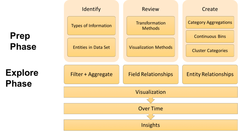
The framework I came up with, pictured below, consists of a Prep Phase and an Explore Phase. Each phase has several steps in it that we will walk through together as we progress through this series.

The series will have four parts. The first two posts will cover the Prep Phase, and the second two posts will cover the Explore Phase.
- Part 1 will introduce the framework, the example data set to which we will be applying it, and the first two stages of the Prep Phase (Identify and Review) which serve to prepare you, the human, for exploring your data.
- Part 2 will cover the third stage of the Prep Phase (Create), which will shift the focus from preparing the analyst to preparing the data itself to be explored.
- Part 3 will begin the Explore Phase, where we will demonstrate various ways to visually aggregate, pivot, and identify relationships between fields in our data.
- Part 4 will continue our exploration of relationships, leveraging graph analysis to examine connections between the entities in our data.
There is an important point about the framework's two phases that I would like to stress here. While you can technically complete the Explore Phase without the Prep Phase, it is the Prep Phase that is going to allow you to explore your data both better and faster. In my experience, I have found that the time it takes to complete the Prep Phase is more than compensated for by the time saved not fumbling around in the Explore Phase. We are professionals, this is part of our craft, and proper preparation is important to doing our craft well.
I hope you enjoy the series and are able to walk away from it with an intuitive, repeatable framework for thinking about, analyzing, visualizing, and discovering insights from your data. Before we jump into looking at our example data set and applying the framework to it, however, I would like to lay some foundation, provide some context, and share with you how I think about data.
Thinking About Data
At the most basic level, we can think of data as just encoded information. But the critical thing about this is that information can be found everywhere. Everything you know, everything you can think of, everything you encounter every moment of every day is information that has the potential to be captured, encoded, and therefore turned into data. The ubiquity of these potential data sources turns our world into a web of complexity. We can think of each data set we encounter as a slice of this complexity that has been put together in an attempt to communicate something about the world to a human or a machine.
As humans, we have an inherent ability to deal with this complexity and the vast amounts of information we are constantly receiving. The way we do this is by organizing things and putting things in order. We create categories, hierarchical classifications, taxonomies, tags, and other systems to organize our information. These constructs help provide order and structure to the way we view the world, and they allow us to be able to look at something, recognize the similarities it has to a group of other things, and quickly make decisions about it.
The fact that we have this ability to create order out of complexity is wonderful, and we use it all the time without ever thinking about it. Unfortunately, that includes when we're analyzing data, and that often makes our processes not reproducible, repeatable, and or reliable. So I wanted my data exploration framework to explicitly take advantage of this ability and help people make better use of it in their workflows.
Our Example Data Set
The data set we will be applying this framework to throughout this series is the Environmental Protection Agency's Vehicle Fuel Economy data set. Here is what the data looks like after some light clean-up.

To get the data looking like this, we first need to download the data to disk.
import os
import zipfile
import requests

def download_data(url, name, path='data'):
    if not os.path.exists(path):
        os.mkdir(path)

    response = requests.get(url)
    with open(os.path.join(path, name), 'wb') as f:
        f.write(response.content)

    z = zipfile.ZipFile(os.path.join(path, 'vehicles.zip'))
    z.extractall(path)

VEHICLES = 'http://bit.ly/ddl-cars'

download_data(VEHICLES, 'vehicles.zip')
From there, we are going to load it into a pandas data frame.
import pandas as pd

path = 'data'

vehicles = pd.read_csv(os.path.join(path, 'vehicles.csv'))
And finally, we are going to clean it up by dropping columns we don't need, removing vehicles that are coming out in the future, removing any duplicate records, and then sorting the data by make, model, and year.
select_columns = ['make', 'model', 'year', 'displ', 'cylinders', 'trany', 'drive', 'VClass','fuelType','barrels08', 'city08', 'highway08', 'comb08', 'co2TailpipeGpm', 'fuelCost08']

vehicles = vehicles[select_columns][vehicles.year <= 2016].drop_duplicates().dropna()

vehicles = vehicles.sort_values(['make', 'model', 'year'])
Identify Stage
Now that we have a clean data set, let's jump into the framework, beginning with the Prep Phase. The first thing we're going to do is identify the types of information contained in our data set, which will help us get to know our data a bit better and prepare us to think about the data in different ways. After that, we will identify the entities in our data set so that we are aware of the different levels to which we can aggregate up or drill down.
Types of Information
There are a few distinct types of information that jump out at us just from taking a quick look at the data set.
- Vehicle attributes information
- Vehicle manufacturer information
- Engine information
- Fuel information (such as fuel efficiency, fuel type, and fuel cost)
- Transmission information
- Drive axle information
There are also some other types of information in our data that may not be as obvious. Since we have the year the vehicle was manufactured, we can observe changes in the data over time. We also have relationship information in the data, both between fields and between the entities. And since we have both a time variable as well as information about relationships, we can learn how those relationships have changed over time.
Entities in the Data
The next step in the Prep Phase is to identify the entities in our data. Now, what exactly do I mean by entities? When I refer to entities, I'm referring to the individual, analyzable units in a data set. To conduct any type of analysis, you need to be able to distinguish one entity from another and identify differences between them. Entities are also usually part of some hierarchical structure where they can be aggregated into one or more systems, or higher-level entities, to which they belong. Now that we have defined what an entity is, let's take a look at the different levels of them that are present in our data set.

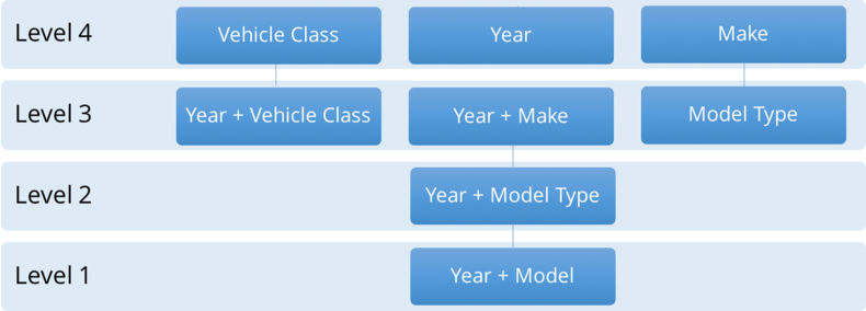
Beginning at Level 1 (which is the most granular level in the data) - you can see the year and specific model of vehicle. The next level we can aggregate up to from there is year and model type, which is slightly less granular. From there, we have a few different directions we can pursue: year and vehicle class, year and make, or we can remove year and only keep model type. Finally, at Level 4, we can further aggregate the data to just the vehicle classes, the years, or the makes.
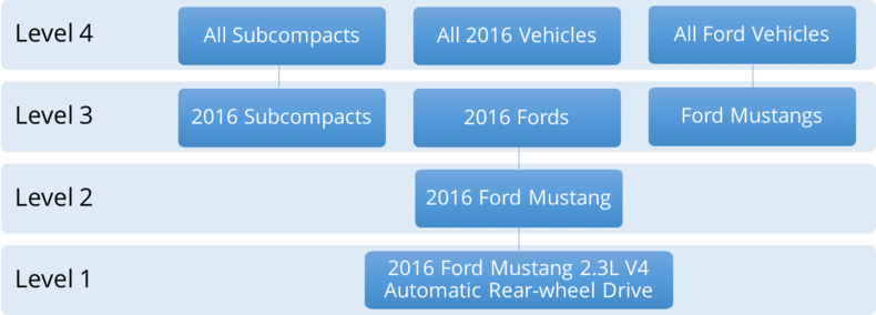
To illustrate even further, here are some actual examples of entities in our data set.

At Level 1, which was the year and the model, we have a 2016 Ford Mustang with a 2.3 liter V4 engine, automatic transmission, and rear-wheel drive. At Level 2, we can roll things up and look at all 2016 Ford Mustangs as one entity that we're analyzing. Then at Level 3, we can either make our entities all 2016 Subcompact Cars, all 2016 Fords, or all Ford Mustangs regardless of the year they were manufactured. From there, we can continue going up the hierarchy.
Again, doing this is important, and it will help you think about all the things you can do to the data and all the different ways you can look at it later on. I see a lot of people that are new to data science who don't do this. They don't think about their data this way, and because of that, they end up missing valuable insights that they would have otherwise discovered. I hope that these examples help make it easier to think about data this way.
Review Stage
The next step in the Prep Phase is to review some transformation and visualization methods. Doing this will ensure that we are aware of the tools we have in our analytic arsenal, what they should be used for, and when to utilize each one.
Transformation Methods
The first methods we will cover are the transformation methods. Let's take a look at some of my favorite ways to transform data.
- Filtering
- Aggregation/Disaggregation
- Pivoting
- Graph Transformation
The first method I have listed here is Filtering, which is making the data set smaller by looking at either fewer rows, fewer columns, or both. The next method on the list is Aggregation/Disaggregation. This is the process of changing the levels at which you are analyzing the data, getting either more or less granular. Then we have Pivoting, which is the process of aggregating by multiple variables along two axes - the rows and the columns. Finally, we have Graph Transformation, which is the process of linking your entities based on shared attributes and examining how they relate to one another.
By transforming the data, you are ultimately altering its structure, which allows you to look at it from several perspectives. And just like looking at anything else from different perspectives, you will learn something new from each way that you view it. The remarkable thing about this is that the number of ways you can transform the data is limited only by your creativity and your imagination. This, for me, is one of the most exciting things about working with data - all the things you can do to it and all the creative ways that you can transform it.
Visualization Methods
In addition to transforming the data, I also like to go a step further and visualize it, as sometimes the transformations you perform can be difficult to interpret. Converting your transformations to visualizations allows you to bring the human visual cortex into your analytical process, and I often find that this helps me find more insights faster, since the visual component of it makes the insights jump right out at me.
Because of this, transformation and visualization go hand-in-hand. Since there are a variety of ways to transform data, there are also several ways you can visualize it. I like to keep things relatively simple, so here are some of the visualization methods I use most often.
- Bar charts
- Multi-line Graphs
- Scatter plots/matrices
- Heatmaps
- Network Visualizations
The first visualization method on the list is Bar charts, which help you intuitively view aggregations by comparing the size or magnitude of higher-level entities in the data. Bar charts are simple, but they can be very useful, which is why they are one of the most popular types of visualization methods. Next, we have Multi-line Graphs, which are usually used to show changes over time or some other measure, where each line typically represents a higher-level entity whose behavior you are comparing.
The third method on the list is a combination of Scatter Plots and Scatter Matrices. Using scatter plots, you can view relationships and correlations between two numeric variables in your data set at a time. Scatter matrices are simply a matrix of scatter plots, so they allow you to view the relationships and correlations between all your numeric variables in a single visualization.
The fourth visualization method listed are Heatmaps, which allow you to view the concentration, magnitude, or other calculated value of entities that fall into different combinations of categories in your data. Last, but certainly not least, we have Network Visualizations, which bring graph transformations to life and let you visualize relationships between the entities in your data via a collection of visual nodes and edges.
We will cover all of these visualization methods in more depth and show examples of them in the other posts in this series.
Conclusion
In this post, we have developed a way of thinking about data, both in general and for our example data set, which will help us explore our data in a creative but structured way. By this point, you should have foundational knowledge about your data set, as well as some transformation and visualization methods available to you, so that you can quickly deploy them when necessary.
The goal of this post was to prepare you, the analyst or data scientist, for exploring your data. In the next post, we will prepare the data itself to be explored. We will move to the last step of the Prep Phase and come up with ways to create additional categories that will help us explore our data from various perspectives. We will do this in several ways, some of which you may have seen or used before and some of which you may not have realized were possible. So make sure to stay tuned!
District Data Labs provides data science consulting and corporate training services. We work with companies and teams of all sizes, helping them make their operations more data-driven and enhancing the analytical abilities of their employees. Interested in working with us? Let us know!
Tony Ojeda - Founder of District Data Labs - Email
